Name, logo, branding, packaging, web, smm
September 2020
What has been done
Date of completion
name & logo
01 – Brief overview
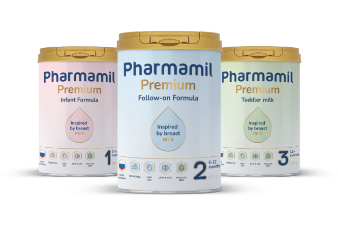
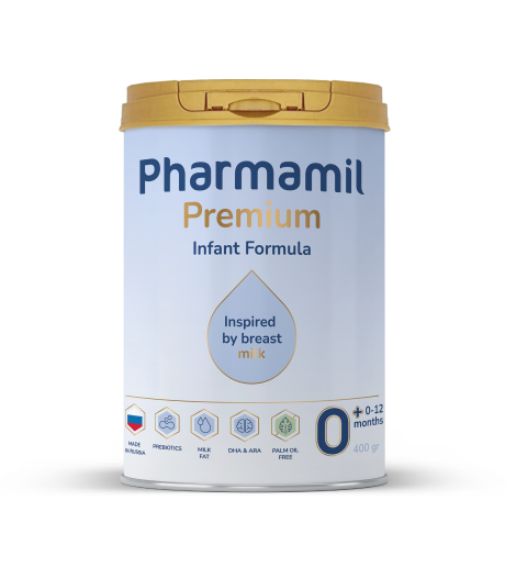
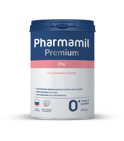
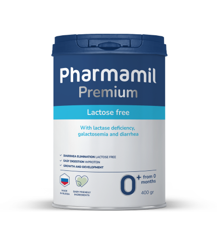
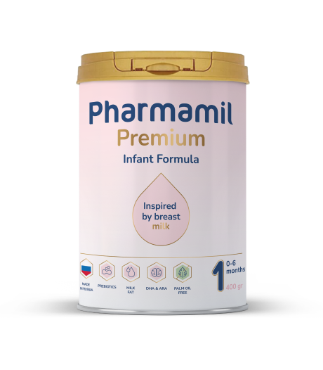
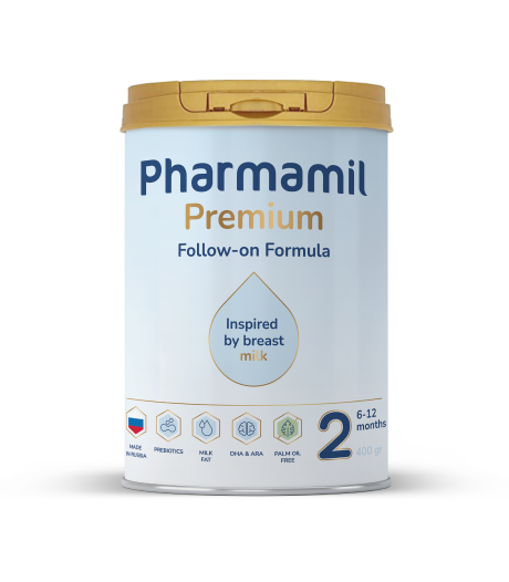
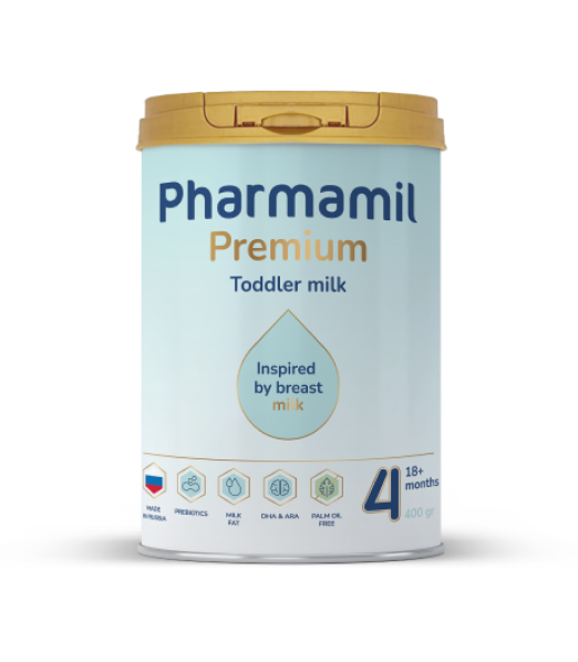
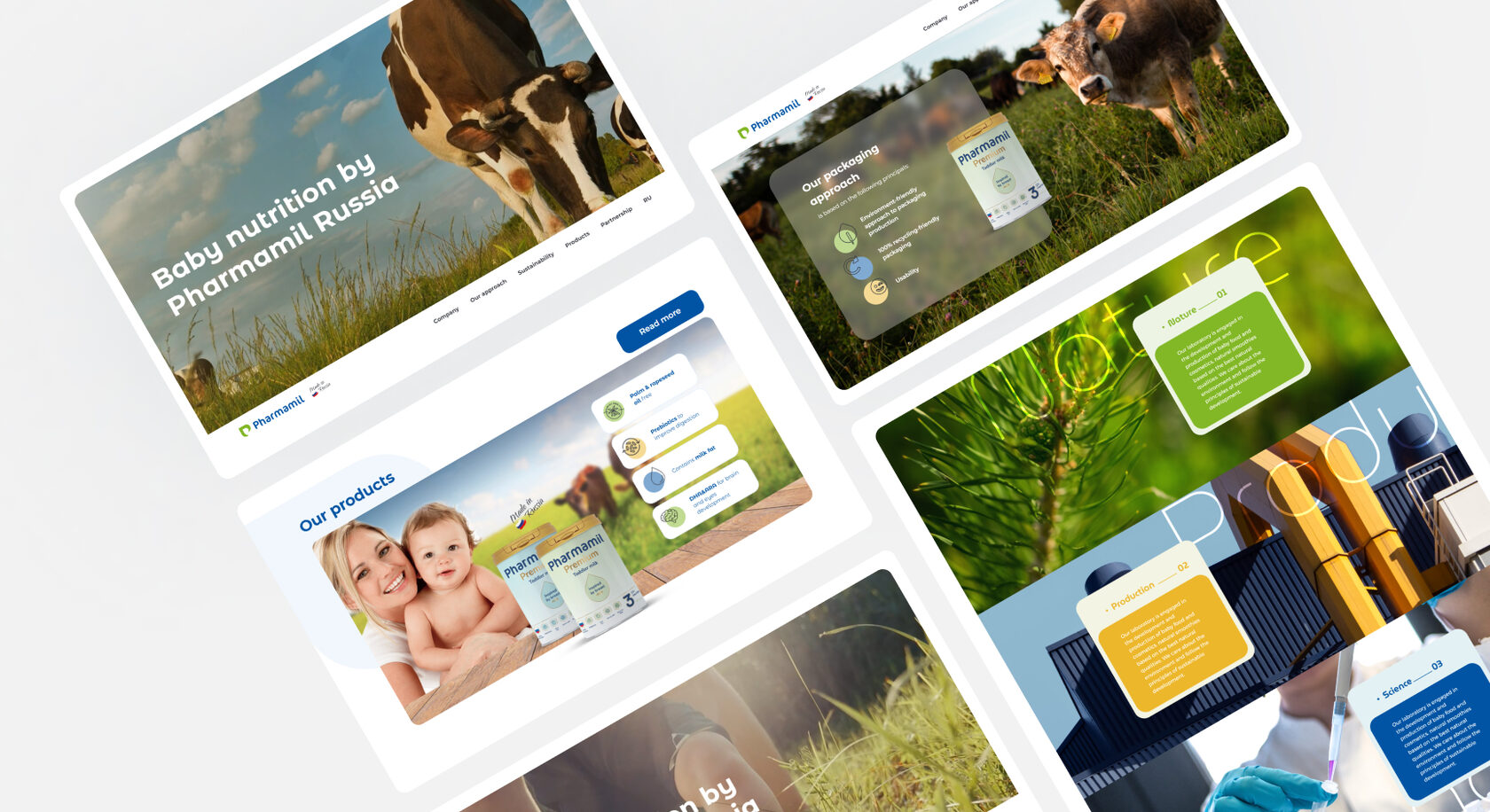
Pharmamil is a brand that emphasizes a natural approach to infant nutrition, inspired by breast milk. The packaging should reflect the brand’s philosophy of "Better by nature," highlighting natural ingredients, science, and care for babies

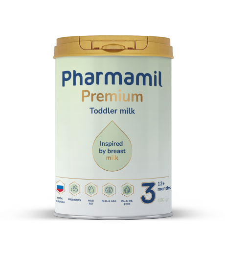
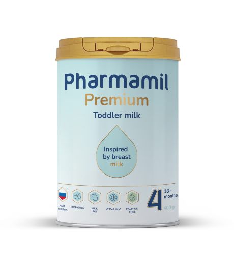
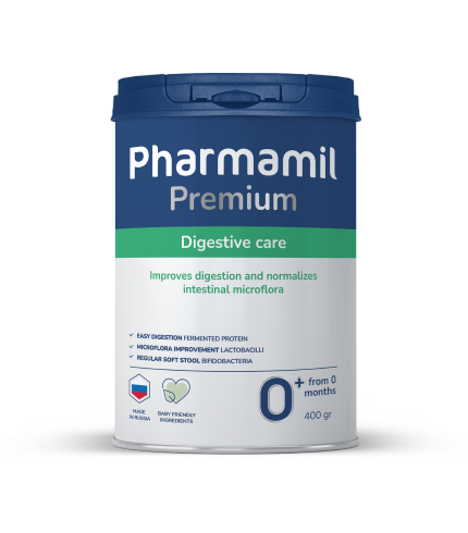
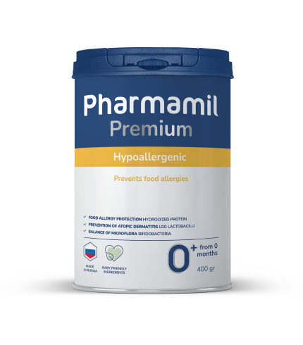
02 – About Project
packaging
Design
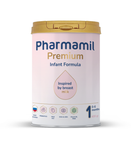
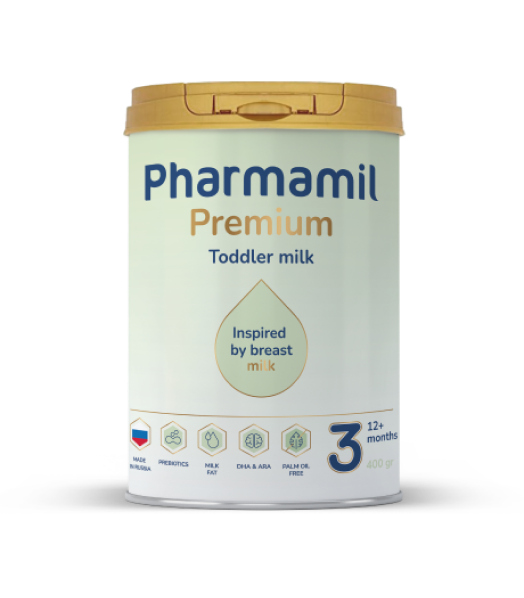
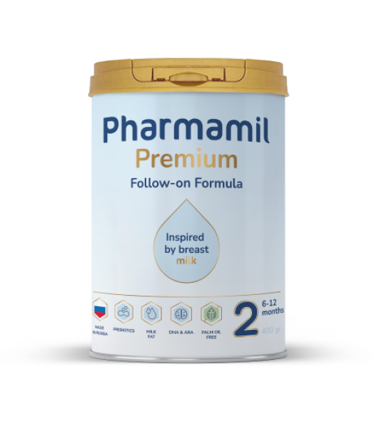
Laconic, light, light design indicates the quality of the brand and inspires trust
Colors
The golden color symbolizes the premium quality of the brand, and delicate pastel colors – taking care of your child
Milk drop
Symbol of breast milk and life energy
you will be interested in these projects
New project on the horizon?
© Digitall Group 2024. All rights reserved


