


Logo refresh, web refresh, ecom, branding
March 2024
What has been done
Date of completion
01 – Brief overview
We successfully executed a comprehensive redesign for Pharmalys Laboratories, revitalizing their logo and website to align with their premium Swiss quality standards. In addition, we developed a full-scale branding package, stand design, and an online store platform for product sales.
The goal is keeping a recognizable company, make it update and adaption for the digital environment
The goal is keeping a recognizable company, make it update and adaption for the digital environment
logo refresh
Before
after
02 – Logo
Icon hidden meaning
The sign has several meanings at once:
The capital letter of Pharmalys
A drop of milk that means life
The tree leaf perfectly represents the idea of our components naturalness
The heart is the love
The capital letter of Pharmalys
A drop of milk that means life
The tree leaf perfectly represents the idea of our components naturalness
The heart is the love


Before
after

03 – About Project
web
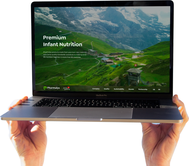
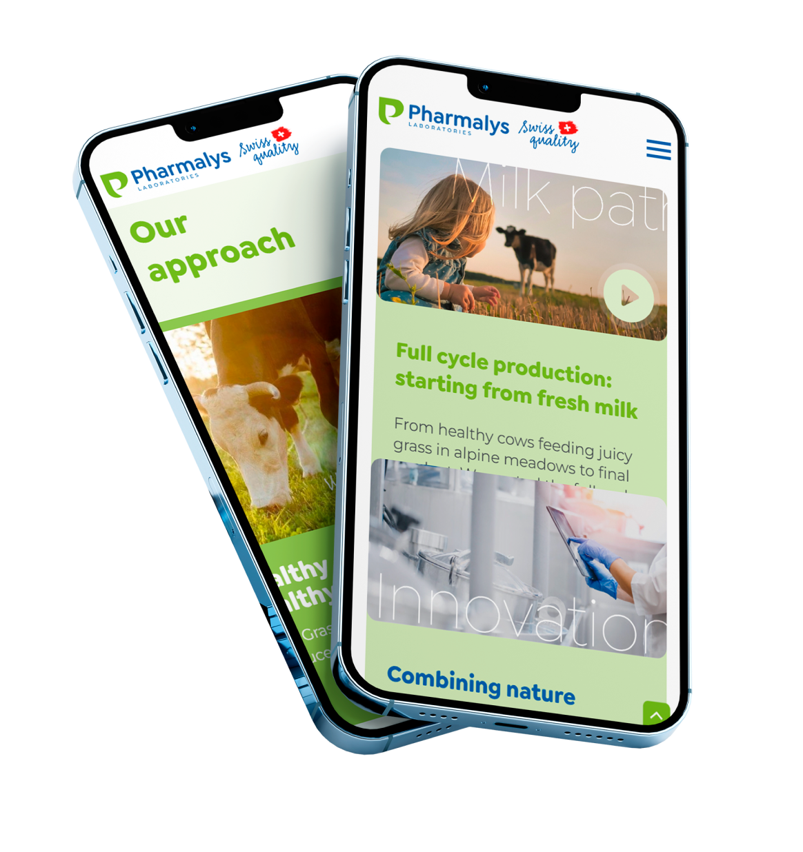
Structure and design
Designing a multi-page website for desktop and mobile versions, taking into account stylistics and design trends
Copyright
Writing a unique text that will resonate in the hearts of customers and catch on from the first words, reflecting the essence
Layout and adaptation
Desktop and mobile layout on the Tilda platform with subsequent animation and SEO development
04 – About Project
branding
Pharmalys Laboratories symbolizes premium quality and reliability in the pharmaceutical industry, rooted in Swiss traditions. The brand focuses on high-quality standards, innovative solutions, and care for customers' health. Our goal is to emphasize the uniqueness and expertise of the company, providing high-quality health products
you will be interested in these projects
New project on the horizon?
© Digitall Group 2024. All rights reserved