


Logo refresh, packaging rebranding, website rebranding, ecom, cmm
July 2024
What has been done
Date of completion
logo refresh
01 – Brief overview
The rebranding of the Swisslac logo presents a more modern and vibrant look, while also conveying a sense of seriousness and premium quality. Majestic mountains reinforces the brand’s reliability and trustworthiness, symbolizing strength and a deep connection to nature.
This updated logo balances boldness and elegance, making it stand out while maintaining the brand's core values of quality and integrity
This updated logo balances boldness and elegance, making it stand out while maintaining the brand's core values of quality and integrity

Before
after
02 – Swisslac brand mascot stages of creation
mascot
Sketch & sketch drawing

The bear is sketched in a simple and exaggerated, cartoon-like style, with round shapes to make it approachable and non-threatening
Illustrated 3D version
Realistic 3D version

Gentle fur-like textures are applied, especially around the body and facial features, adding some depth while keeping it aligned with a cartoonish style
The final 3D mascot strikes a balance between realism and the playful, comforting nature of a children’s character, making it an effective and endearing representation for the Swisslac brand


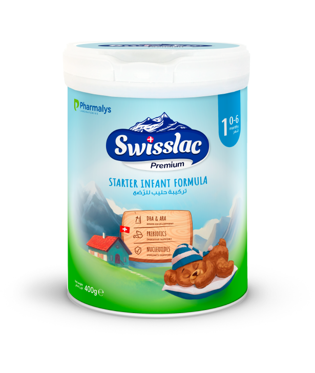
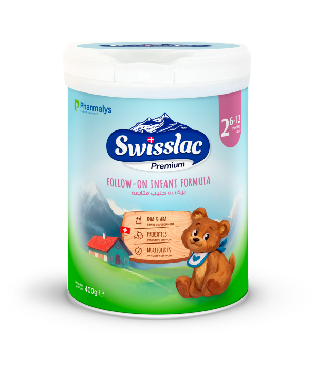
03 – About Packaging
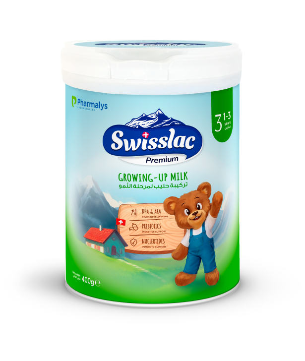
infant formula
The new Swisslac Premium packaging in soft light tones emphasizes the premium nature of the brand. At the same time, the design retains a playful touch and draws attention with illustrations. A minimalist approach without excessive bright elements helps maintain focus on the most important aspects – the product's quality and key benefits – making the packaging appealing to both parents and children
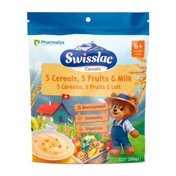
cereals
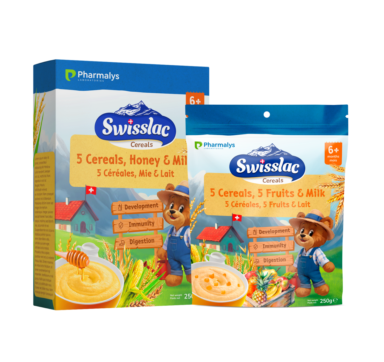

The Swisslac Premium Сereals packaging features a friendly farmer bear set against a scenic Swiss landscape, highlighting the natural, high-quality ingredients. The playful bear appeals to children, while the serene backdrop emphasizes the product's purity and premium quality, making it both inviting and trustworthy for parents seeking nutritious options

you will be interested in these projects


New project on the horizon?
© Digitall Group 2024. All rights reserved